
Pantone 2016 Colors of the Year
Pantone
October 17, 2016
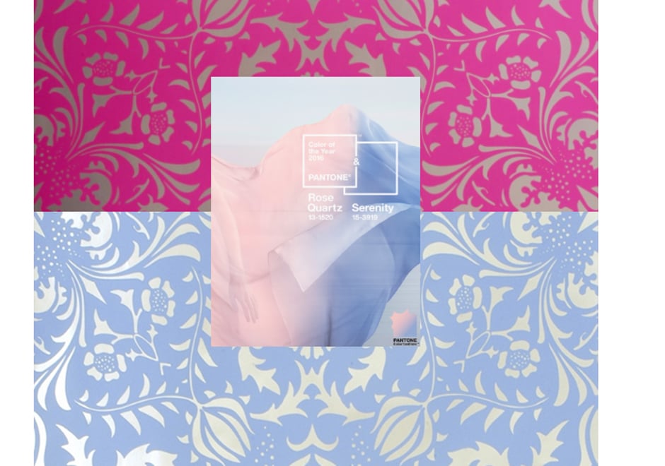
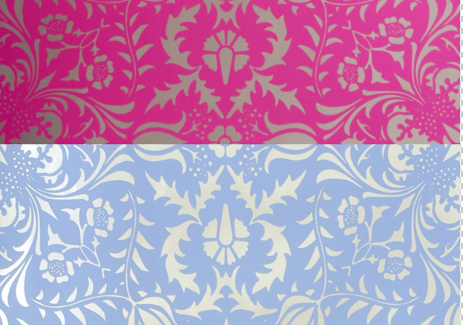
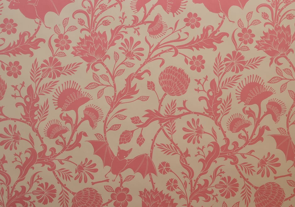
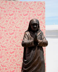
Marking a poignant change for the brand, Pantone has chosen two colors for their 2016 color(s) of the year: Serenity and Rose Quartz. The color combination evokes the tranquility sought by consumers to escape the stressors of everyday life, and is a strong symbol for the company: the duality of color signifies the blending of gender norms in today’s culture. The color combination challenges the traditional ideas of color association: reds and blues; warm and cold colors merge together to create a visual interpretation of the world’s’ changing attitudes.
What better place to incorporate these colors than in your home? Click through to see some of our in-line designs with similar palettes and, while known for our use of vibrant colors, Flavor Paper can help you customize all of our patterns to help create a calmer space, bringing mindfulness to your the home through wallpaper. 2016 is almost over, but luckily these colors never go out of style. Pantone
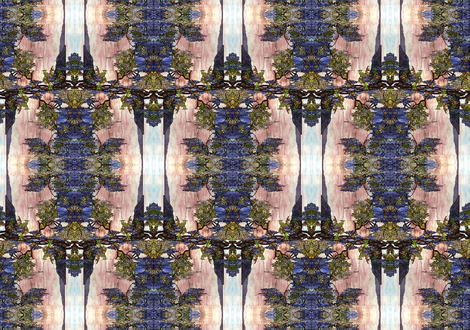
Patterns
Filed under: