
2021 Flavors of the Year
Flavor Kitchen
January 4, 2021
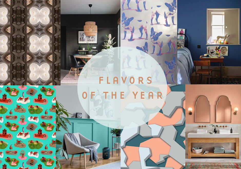
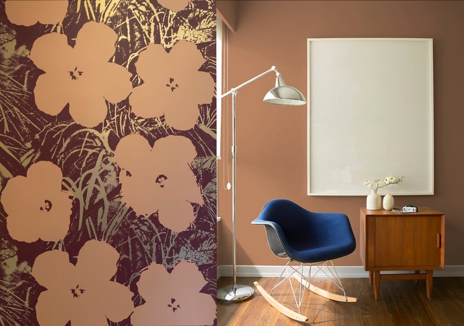
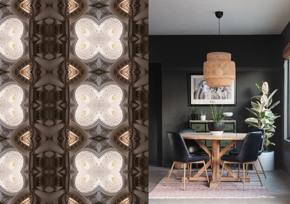
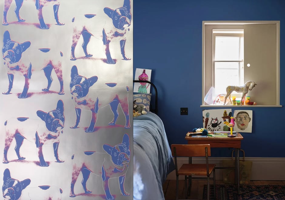
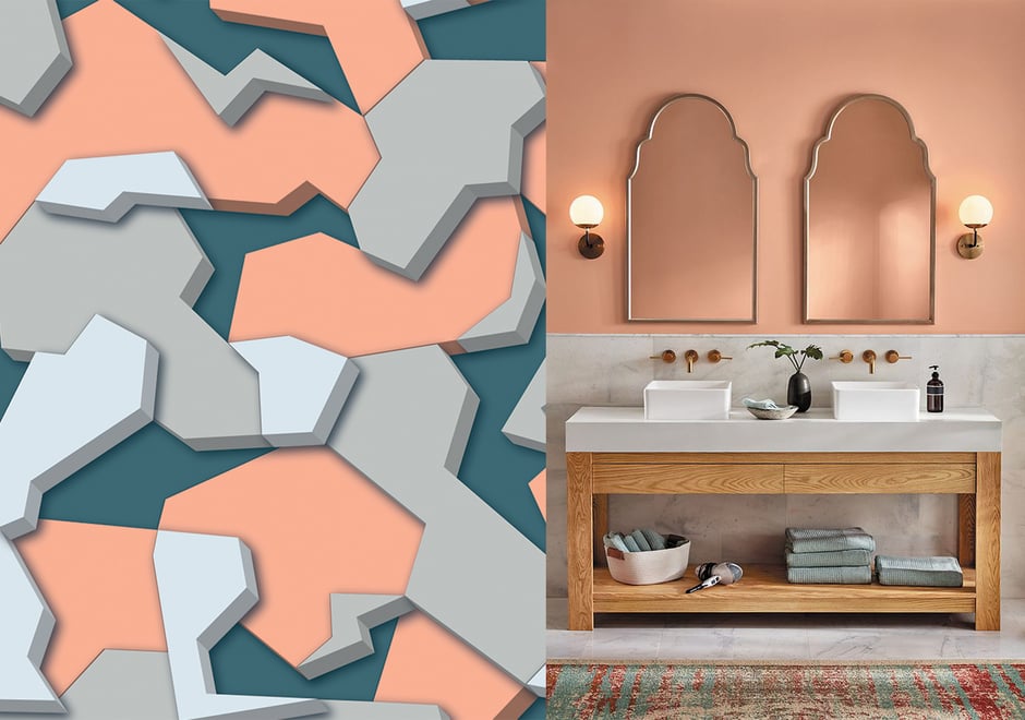
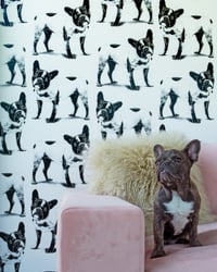
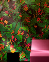
Trends…they’re not really our bag. Where’s the fun and originality in that? That’s why we work with adventurous design enthusiasts, and uniquely partner with celebrated artists to explore unexpected visual narratives that stay ahead of the “rage.” In fact, sometimes we even set the bar for what’s poppin’. But, every year paint companies and color pros single out a shade (or shades) that captures the current moment in design, gathering insights from fashion, tech, architecture, and pop culture and deem them the go-to hues. For 2021, it’s all about balance, serenity, cozy, and calm. We’re down-ish. And, we’d be remiss not to join the conversation and help offer alternative/complementary decorating options to those looking to tap into the now — with a flavorful twist, of course. Here, FP founder + creative director, Jon Sherman, shares some feels on this year’s Colors of the Year and the concept as a whole, as well as pairs top paint picks from Benjamin Moore, Farrow & Ball, Glidden, Pantone, Sherwin Williams, and Valspar (peep the image carousel) with wallpapers that will work well together or serve up fresh, feel-good vibes on their own.
Yay or Nay on Colors of the Year? I generally feel they are gimmicks intended to garner press attention for paint companies who might otherwise find it difficult to get coverage (no offense). As for the colors themselves, they are seldom inventive or boundary pushing. Regarding this year’s mix, I like them all and we have most in our line somewhere — other than Farrow & Ball’s Dead Salmon!
Do the colors play into FP’s design decisions? No, we typically have the announced colors in our repertoire already and really don't follow trends. If it happens to be something we do not have in our line, clients may ask to match it and incorporate it into a pattern, which is something we do quite often.
Are clients craving Flavors based on Colors of the Year? I think some designers look to the palette groupings releases for inspiration, but it is rare that a client is basing a decision on a Color of the Year. More often we see designers pulling a color from a wallpaper they love in order to add accents.
Any tips for nailing the application of the colors? That really depends on how bold the color choice is. There are a few this year that are quite vibrant and would be very strong for most people to use in a full wall application, but we have many designs where those colors can be used a bit more sparingly and not overpower a space while adding a nice, current pop of color.
How does the use of color affect design? Color is very impactful on people's moods and feelings. There is an entire field dedicated to this called Color Psychology. It informs purchasing decisions as well, which is why certain corporations have chosen and then trademarked their brand colors.
What’s 2022 looking like in terms popular shades? Soft and warm will be very popular due to the ongoing pandemic and general feelings of vulnerability, and a desire to be comforted and protected. It has been a ride.
What else? Culture and geographical reference is very important in how people see and use color, so you have to be aware when working in different parts of the world — white symbolizes purity in the West yet in the East it is seen as a color of mourning.
Patterns
Filed under: Fashion, Design News